
Complete CSS Flexbox course & a real world website project
Learn all the CSS Flexbox concepts and create completely responsive design & elements - real world hands-on training
 Bullstrack
Complete CSS Flexbox course & a real world website project udemy course
Learn all the CSS Flexbox concepts and create completely responsive design & elements - real world hands-on training
What you'll learn:
- understand everything about flexbox and how it actually works
- build advanced responsive layouts fast and easily with minimal code using flexbox
- build menus using flexbox
- build a complete website with advanced responsive layouts like ( the holy grail layout – the equal columns layout – the horizontal masonry layout ) and so much more!
- enhance your productivity and save more time as a web developer
- build photo galleries using flexbox
Requirements:
- An Internet Connection
- Basic Understanding Of HTML & CSS
- Any Code Editor Of Your Choice
Description:
Before Flexbox arrived on the screen, we had to use relative or absolute positioning, floats, clears and 100s of lines of code to achieve a decent website layout.
All of that's changed now.
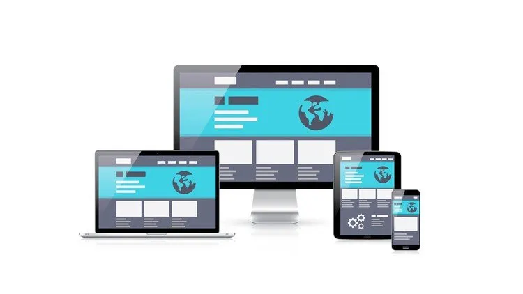
With CSS Flexbox, you can layout your website's design in just a few lines of code, and even make it responsive!
No more frameworks like Bootstrap to make up for the shortcomings in CSS. Become a professional web designer in just a few hours.
If you know the very basics of HTML and CSS, you're all set.
Spend a few hours learning a bunch of Flexbox syntaxes, and you'll be creating awesome web layouts in no time at all!
You don't need to learn a bunch of frameworks to become a pro web designer now!
What will you learn in our course?
1. How to create a simple one dimensional web layout with header, footer, 2-3 columns with content and navigation bar without using floats or positioning properties.
2. How to make your website, no matter the layout, into a full-blown responsive website, without using any external frameworks like Bootstrap.
3. How to create widgets, carousels, applications, galleries, navigation bars, menu items etc., and how to display & position them without worrying abut collapsing elements like you usually do.
4. How to control the position, size and spacing of elements relative to their parent elements and each other and how to make each item responsive.
5. How to layout the elements of your website horizontally or vertically or both and how to change the alignment with just a single line of code.
6. How to order elements on the page without changing their order in your HTML code.
7. How to automatically change the width and heights of the elements so they fill up the space of their parent containers, without giving fixed dimensions.
What are some real world applications of what you learn in this course?
By applying the concepts you learn in this course, you can code and design:
1. A simple, one dimensional, 2 or 3 column website that are perfect for small businesses.
2. More complicated websites with more columns. With the concepts you learn, your imagination is your only limit. You can make the layout as simple or complicated as you want it to be.
3. Create websites for smart phones and tablets. Responsive web designing.
4. Turn an existing website responsive by adding flexbox properties to the layout.
5. Create portfolio websites of every kind that can be showcased in your projects and job applications.
6. Get freelance projects on the fly because you now have a VERY valuable skillset added to your resume.
Sky is the limit! You can apply what you learn here anywhere in the web space, in any sphere.
Your imagination is your only obstacle to how you apply what you learn here in your real world projects.
How is this course designed?
Our course has 4 modules, where each module will thoroughly explain the intricacies of one of the concepts in Flexbox with a wealth of over-the-shoulder examples.
We'll be using a real world example to explain the concepts.
Here are the modules:
Module 1 - Flex container and display - This is the foundations module. We’ll look at how to make an element a flex container so that its child items can be manipulated. We'll also look at what Flex items are and their significance. In this module, we'll be creating and designing a menu bar, one that looks like the ones used in websites of the real world. We'll be using this menu bar to explain the Flex properties and how they affect website elements.
Module 2 - Basic flex properties - In this module, we’ll look at how to manipulate the flex items of a flex container, that is, how to shrink it, grow it, wrap it if it gets too big for the screen, set a basic width or height for it, etc.
Module 3 - Enhancement properties - We’ll look at further enhancement properties for the flex items, like aligning them in multiple ways, manipulating individual items, changing orders, etc
Module 4 - Create a website - real world project - In this module, you'll learn how to create a simple, 2-column website, one that looks like most of the small business HTML websites out there. You'll also learn how to make it completely responsive.
We also cover a lot of examples and projects, like:
1. Mini project at the start of the website where we create a real world navigation/menu bar and make it completely responsive.
2. A real world 2-column website with a responsive header, navigation bar, 2 columns (main content and sidebar) and footer. We'll also make the entire website responsive.
Why should you choose our course?
1. We like to be thorough in our teaching. You'll find everything you need to start creating awesome web designs and layouts with Flexbox code/syntaxes in this course. You won't have to look anywhere else.
2. We strongly advocate learning by doing, rather than just listening or reading. Our lectures are filled with a wealth of examples that explain every concept clearly.
3. If you follow along with our examples in our over-the-shoulder trainings, and create the mini project and apply the properties along with us, you'll be confident in embarking into the world of Flexbox and web design (responsive and otherwise) by the time you finish our course. You'll be able to confidently add this as a skill in your resume.
4. We prefer creating fun projects to explain the concepts and to keep things interesting as well. You'll learn how to apply the concepts you learn in the course in the real world projects and examples.
So, what are you waiting for? Enroll now and start creating awesome web layouts and designs with CSS Flexbox syntaxes in no time at all!
Who this course is for:
- A fledgling designer who wants to start creating better websites.
- Responsive web designer who's stuck in the world of Bootstrap and wants a simpler solution.
- Experienced web designer who wants a simpler way of creating website designs and layouts.
- Freelancers, employees, students - anyone can take up our course and benefit from it.
- Oracle PL/SQL Fundamentals vol. I & II
- Master Visual Studio Code 2022: Your Complete VS Code Guide
- Java In-End to End: Become a Complete Java Engineer!
- Purchasing your first investment property
Course Details:
- 3 hours on-demand video
- 3 articles
- 2 downloadable resources
- Full lifetime access
- Access on mobile and TV
- Certificate of completion
Complete CSS Flexbox course & a real world website project udemy free download
Learn all the CSS Flexbox concepts and create completely responsive design & elements - real world hands-on training
Demo Link: https://www.udemy.com/course/complete-flexbox-course-with-a-real-world-website-project/